
World of Warcraft Review
2004Blizzard EntertainmentGame
It won the genre by deleting the friction everyone else had mistaken for the point.
| Category | Critic | Users |
|---|---|---|
| Difficulty to make | Great | |
| Visuals | Good | |
| Story | Good | |
| Gameplay | Great | |
| Overall | Great |
Blizzard's insight was that the massively multiplayer genre was failing on friction rather than on features, so they removed nearly all of it. Corpse runs are short, death costs little, quests tell you where to go, and the class fantasy is legible within ten minutes. Zones are shaped like funnels that hand you to the next zone at exactly the right level, which is why leveling in 2004 felt like a designed campaign instead of a treadmill.
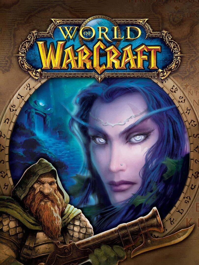
The stylised art direction was a deliberate bet against photorealism and it has paid dividends for twenty years, since Azeroth runs on anything and still communicates at a glance. Combat is a slow global cooldown with a small button set, closer to turn-taking than action, and the original raid tier gated forty players behind attunement chores that were tedious by any standard. What made it enormous is the density of small handmade moments across a continent, and the fact that other people were always standing in them.
World of Warcraft at a glance
Official site- Platforms
- PC, Mac
- Developer
- Blizzard Entertainment
- Year
- 2004
What’s your grade?
Grade by category
No account needed. Sign in so your grades follow you and count once. · how vote integrity works
Comments
Plain text, 500 characters. Be sharp, not cruel.
No comments yet. Have the first take.